
How architects turned a hulking brick box into MIT’s newest academic hub
It started with a vision: Move MIT’s School of Architecture and Planning (SA+P) into the Metropolitan Storage Warehouse, an unoccupied, fortress-like brick building on MIT’s campus in Cambridge, Massachusetts.
After all, SA+P needed more space and new facilities. And here, visible from its old offices across the street, was an unused building the size of an airplane hangar. It could offer bigger studios, more work areas, an auditorium, and galleries for events, and become a campus-wide hub for teaching, research, and public engagement.
“MIT thrives on this idea that we’re all connected,” says Hashim Sarkis, dean of SA+P and a key proponent of the project.
But that vision required hundreds of design decisions: how to bring light into the building, create workspaces and circulation, encourage communication among the school’s populations, and more.
“The conception of the project was not like an automatic flash,” says Elizabeth Diller, founding partner at Diller Scofido + Renfro (DS+R), the architecture firm that was selected to revamp the Met Warehouse, as it’s now called.
“It was a very challenging building to work with,” says Benjamin Gilmartin, another DS+R partner. “There was a lot of innovation needed.”
Innovation is welcome at MIT, however.
“They transformed the Met Warehouse toward the things we want, which is to do more collaborative work, and to combine instruction and research,” Sarkis says.
Here’s how DS+R, working with MIT over several years, created the new Met Warehouse — which has a ceremonial moving-in procession on Sept. 8.
Five buildings in one
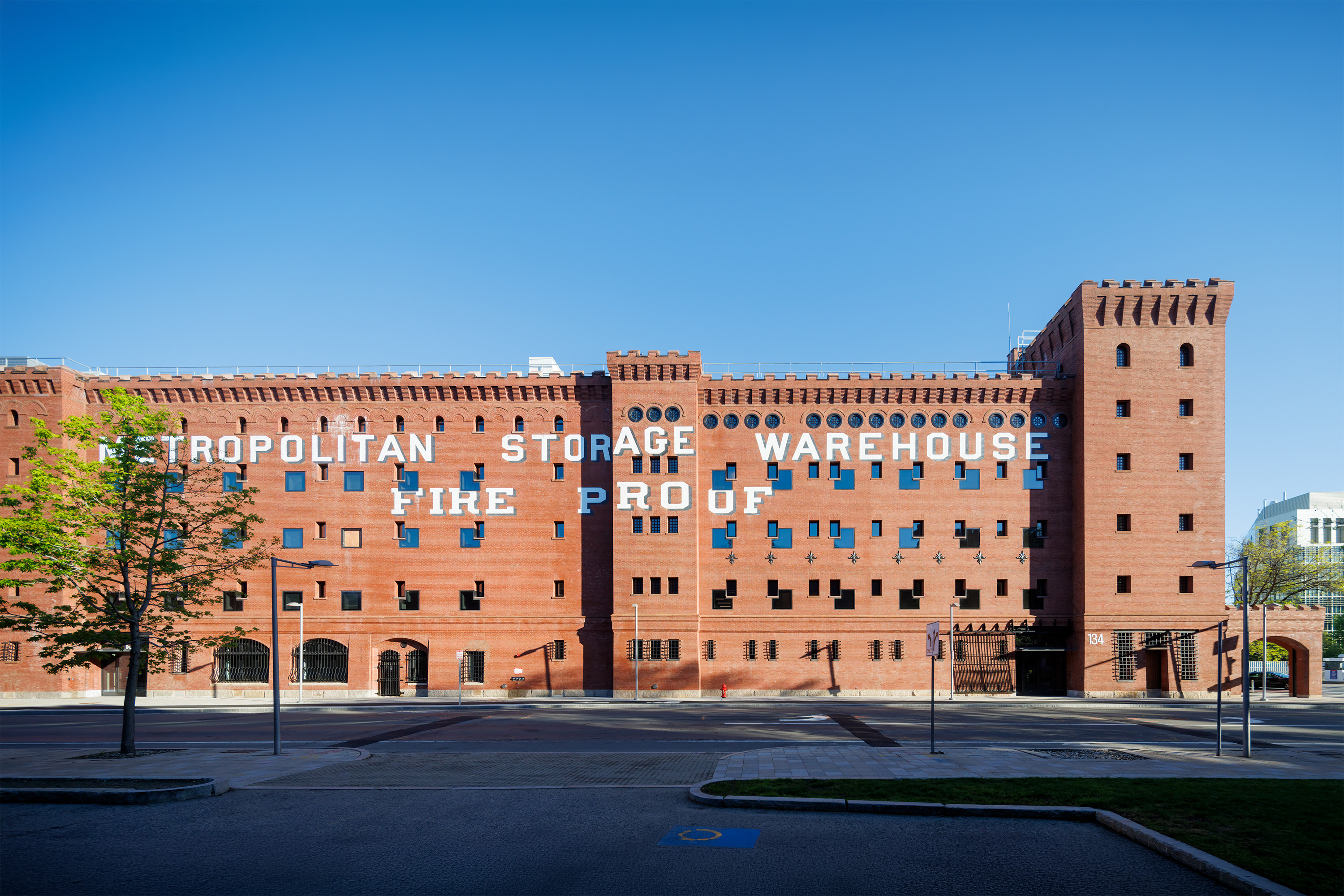
The Met Warehouse was built in several phases starting in 1894; by 1923 it was a five-story building with 2-foot-thick brick walls and 1,500 storage units inside. It was a fortress used for private storage, with the words “Metropolitan Storage Warehouse Fire Proof” painted on the side, visible from across the river in Boston.
The structure was built in five segments, over time. That became crucial to its transformation. Diller and Gilmartin created a large design studio inside each of the segments.
“When you start a project like this, there are some big moves that seem very clear and obvious,” Diller says. “There are five buildings that were built basically in succession, making for a 500-foot long building. That is just too big, so how do we break it up into neighborhoods? We decided each building itself would have a stack of floating studios in it.”
That was essential for SA+P and the components of it that will use the building, such as the MIT Morningside Academy for Design, which was established through a $100 million gift from the Morningside Foundation, the philanthropic arm of the T.H. Chan family. This founding gift from family members Gerald and Beryl Chan and Ronnie and Barbara Chan included support for the Met Warehouse transformation.
Each building segment features double-height, column-free studios which, thanks to virtuoso engineering, are suspended from roof trusses that bring the weight back down to the existing structure.
Those spaces will benefit the interdisciplinary work taking place at MIT.
“In those five spaces, we’re putting the making and the research together,” Sarkis says. “The studio and the lab will become one and the same.”
Bringing in light
For about a century, the Met Warehouse featured tiny window slits as its only apertures. That raised a question: How could natural light be brought inside?
DS+R produced a dramatic answer, drawn from recent architectural history. Along the long north side of the Met Warehouse, adjacent to a set of railroad tracks, they carved large voids for the studios. Aligned with the studios, large segments of the brick exterior were replaced with glass facades.
This way, natural light pours into the studios and beyond, while occupants look out to a lively Cambridge cityscape.
“The process was like an extraction of the dense mass of the building to create open and light-filled space connecting all,” Diller says.
Her aesthetic inspiration included the artist Gordon Matta-Clark, known for making bold cuts into New York City buildings in the 1970s.
“Right from the beginning there was a nod to Gordon Matta-Clark,” Diller says, though she notes that Matta-Clark’s work consisted of building-scale interventions motivated by political and social critique. Whereas, “In our case, we use subtraction to build — to make space for new uses and to expose the anatomy of the building.”
The living lab
To ensure the huge cuts and windows would work, MIT collaborated with DS+R, as well as Leers Weinzapfel Associates, the project’s associate architects, and Shawmut Design and Construction, to test slab cuts and window arrangements directly in the Met Warehouse itself.
“This hands-on approach allowed us to prove the design concepts through actual construction methodologies and logistics,” says Nicole Bernabei, a senior project manager for campus construction at MIT, who has worked on the Met Warehouse effort since 2018.
Those slices into the building, needed to create the studios, revealed the Met Warehouse’s original structural features as cross-sections now appearing in walls. The designers envisioned those cuts as features to remain visible, something students can still learn from.
“For a school of architecture and planning, this approach feels especially fitting,” Bernabei says. “The building itself has become a teaching tool — a living laboratory where students, faculty, staff, and visitors experience how rigorous design thinking translates into a built reality. Every detail, from the celebrated slab edges to the transformative light, tells the story of collaboration and precision.”
And while those issues were being addressed, the architects had to grapple with, well, everything else.
Asymmetry inside
There is another reason the architects placed the huge glass walls on the north side of the Met Warehouse. The Cambridge Historical Commission (CHC) asked MIT to keep the building’s south and east sides essentially intact. The long south facade, the one historically visible from Boston, was particularly significant.
“Changing the building’s surface there [on the north side], bringing in the large glass, wouldn’t impact the character of the building as it would on the south side,” Diller says. For that reason, in the interior, “the big spaces drift to the north.”
The architects placed smaller spaces, like offices, on the south side.
“The fabric of the existing Met Warehouse building, with its column grids, offered a lot of opportunities for more serialized smaller spaces where you can have seminars, faculty offices, teaching spaces, research areas, next to and in dialogue with the larger multistory spaces that we introduced,” Gilmartin says.
So, the Met Warehouse is asymmetric inside: big studios extending from the north side, across much of the building; and smaller rooms on the south side.
It was not obvious how to bring more light into the south-side rooms, however. But an extended dialogue between DS+R, MIT, and the CHC produced an “intersect window” strategy — box frame windows sometimes intersecting with the small apertures already on the south side. The steel frames of the new windows, now at a proper height for looking out, distribute the weight of the brick and stone sills once carried by the solid brick that was removed.
“This meeting of the old and new satisfied the Cambridge Historical Commission’s desire for a minimal touch, but also created an unexpected and delightfully playful effect on the south facade,” says Morgan Pinney MArch ’10, a senior campus planner at MIT. The project, she adds, “allowed us to step into an exceptionally collaborative working relationship with CHC staff — one MIT is very proud of and will certainly continue to build upon for years to come.”
The unusual layout grants a centrality to the studio areas while ensuring that a full range of other spaces are wrapped around them.
“The logic of the building is that making things is in the middle,” says Sarkis, referring to the studio spaces. “This is MIT. There is making and research in the studios, with seminar rooms and offices all around.” Referring to the school motto, “mens et manus,” he adds, “That’s our culture. MIT is about mind and hand.”
Still, Sarkis and the architects wanted another element inside, too: interior passages connecting it all.
Extending the Infinite Corridor
MIT’s main group of buildings features the Infinite Corridor, a busy walkway spanning one-sixth of a mile indoors, linking many other spaces. MIT leaders thought the Met Warehouse could extend the concept.
“We conceived of it as having an ‘Infinite Corridor,’” says Sarkis, who hoped the corridor would be “visible and accessible all the way through.”
Diller, the architect behind New York City’s High Line, which turned elevated railroad tracks into a wildly popular urban park, knows about getting people walking. She wanted Met Warehouse occupants to “share a circulation system.”
And so every floor of the Met Warehouse has its own “infinite” corridor. Some overlook studio space one floor down, with the cityscape beyond, echoing High Line atmospherics. The off-center circulation spine connects the large studios on the north side and the offices at the south edge of the building. Being flexible about that placement allowed the whole Met Warehouse plan to work.
“That helps create the space for the large studios,” says John Ochsendorf, director of the MIT Morningside Academy for Design. Besides, he offers, “There’s a happy alignment between historical protection of the south facade, and where the sun is in the sky most of the year. You don’t want direct sunlight on the south side” — where glass walls would create a greenhouse effect — “and the city wanted to protect that view. The architects found this balance.”
A vertical vision
Meanwhile, the architects designed large stairs that pierce through the corridors, helping people access all floors of the building.
“We didn’t want a layering of the building with horizontal stratification,” Gilmartin says. The stairs will provide “moments of serendipity and exchange with other people.”
The first time Gilmartin drafted stairs for the building, they were “more blade-like and expressive formally” than the final version. But MIT asked for a stripped-down sensibility, so Gilmartin made the design “almost as simple as it could be.”
The stairs still have expansive scope and meeting-place potential.
“That central spine stair is sort of a ceremonial stair,” Diller says. “To see and be seen. I think it will be lively.”
Culture change
The Met Warehouse is very different from the previous quarters of SA+P, a warren of rooms in MIT’s buildings 7 and 9. Many peer institutions have design studios that place all students in a large common space. Not MIT, which has had a different culture, with smaller, specialized design spaces.
Now, the Met Warehouse does feature larger and more visible design areas.
“We’re trying to give the school the ability to adapt it and change it, and balance the past culture of MIT and a new culture with kinds of spaces where ideas can cross-pollinate and there’s a lot of room for large-scale experimentation,” Gilmartin says.
Design practice is becoming bigger across MIT, and as more people connect with it, the Met Warehouse will let MIT evolve.
Gilmartin again: “There’s just a lot of opportunity for smaller groupings of people to be organized in ways that are visible and connected to the larger spaces, but also offer the prospect of a retreat and focused work. I think it is hopefully attuned very well to MIT.”
The shock of the rebuilt
It’s unusual to move a major architecture school into an old building. Some of the best-known U.S. universities house their architecture schools in buildings with high-modernist stylings or postwar brutalist aesthetics, heavy on concrete, light on graceful curves.
“Those buildings come out of the modernist tradition predicated on the shock of the new,” Gilmartin says. “There was something confrontational about those buildings in their material expression and image, and spatial ideas of openness and flexibility, which was quite different from most historic buildings. In their time, they were pretty thrilling.”
But as the saying goes, that was then, and this is now.
“The reality of our future is that we can’t tear everything down and build new for every generation,” Gilmartin says. The Met Warehouse “makes a claim about the future of design and what the orientation of that needs to be, in our work,” he adds.
MIT agrees.
“I think it sends a very good message that this vanguard school of architecture, at the Massachusetts Institute of Technology, is moving into a historic building and adapting it for the future,” Sarkis has said.
Along with the Morningside Foundation, another key project donor was Sidara (formerly the Dar Group), a global collaborative of specialist design, engineering, and consulting firms, owned by Maha and Talal Shair; they have supported the creation of the building’s Sidara Auditorium and Sidara Gallery space.
Adaptive re-use
Ultimately, DS+R was ideal for the Met Warehouse project because of their experience transforming structures. Besides the High Line, they transformed a London media center built for the 2012 Olympics into the Victoria and Albert Museum’s new open storage facility, the V&A East Storehouse.
Diller suggests the key is being pragmatic.
“When you have a building that is that thick, that heavy, that present, sometimes it’s more expensive to demolish it than to invent a way of reusing it,” she says.
Besides, she adds, “Because it’s an architecture school, it’s important that the students understand adaptive reuse firsthand, as we share a planet with limited resources. It’s a good thing to repurpose buildings, to change their program, to update their innards where possible, rather than just preserving them in formaldehyde — or destroying them and taking away the character of a city.”
The Met Warehouse was old, is new again, and is ready for the MIT community to make it their own.
“Very often contemporary buildings are so sanitized and clinical, you don’t feel like you can touch anything,” Diller says. “It doesn’t feel like home. Here, we wanted students to feel uninhibited — a place that would feel like home.”
What did you think of this news? Leave a comment below and/or share it on your social media. This way, we can inform more people about the hottest things in technology, science, innovation, and gaming!
This news was originally published in:
Original source
